RAI Unveils New Brand Identity
We are excited to unveil a new brand identity, including a new visual identity along with a new brand campaign, reflecting the company’s transformation and a redefined strategy focused on our global customers, suppliers and strategic partners. RAI’s new look and feel represents a commitment to the very bonds that have helped build a strong presence in the markets we operate and the company’s role and purpose of helping the world progress, by being the catalyst that unlocks the potential of people, businesses & communities.
Here’s why
While our business has transformed dramatically over the past few decades, the wider perceptions of the company have not evolved at the same pace. The rebranding marks a new RAI, both inside the company and out, with a strategy hyper-focused on our global customers and the polymer industry that is undergoing a global shift. RAI’s core values of care, courage, dedication, performance and simplicity, along with its clear strategy, will power the company’s transformation as we partner with the industry and our clients to help them better harness the world of polymers in transforming our world for a better future.


New Logo
Go Even Further!
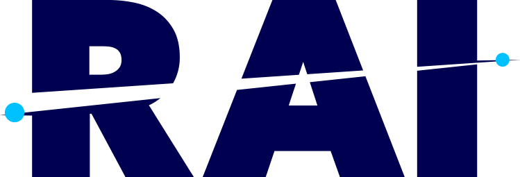
As a prominent representation of the company, people and brand, the new logo is agile, purposeful, optimistic and smart. Inspired by the universal representation of ‘Point A to B’ as well as a meaningful evolution of the orbit from of our earlier symbol, our new symbol comes together with our word-mark to subtly cut through in the negative space, signifying our journey across the world and the constant momentum that is required to sustain in our industry- reminding us constantly to go even further!

New BRand Colors
Energetic Synergy
The new RAI brand brings forth a multitude of fresh colors reflecting the diversity and richness in people, markets and culture we have embraced over the years. While the darker tone of our blue speaks to the confidence gained as a result of the sheer market authority and business intelligence we have enjoyed over the years, the lighter blue is a testament to the trustworthiness and reliability the brand RAI stands for today. We use the sobriety of blue combined with a vibrant color palette to emphasize our creative thinking and flexibility.

New Purpose Statement
Humans First – Always
Over the years RAI has matured organically by embracing a more purpose oriented way of working and living. In everything what we do, we have realized, our thinking and actions are influenced greatly by a higher purpose, motivating us to be the catalyst that unlocks the potential of people, businesses & communities. There is little wonder then, most of our customers, suppliers and partners are simply a result of a strong bond build through years of association and personal relationships.
We are Transforming to Go Even Further in the Future
As we celebrate our 33rd anniversary this year, we want to accelerate our distribution services and strengthen our presence worldwide. To achieve these goals, we are consolidating all operations under a new unique but much familiar name reflecting our global DNA and a new visual identity that highlights our expertise.


